Data Storytelling – Can numbers tell a story?
Video Blogs (vlogs) – Data Storytelling – Can numbers tell a story?
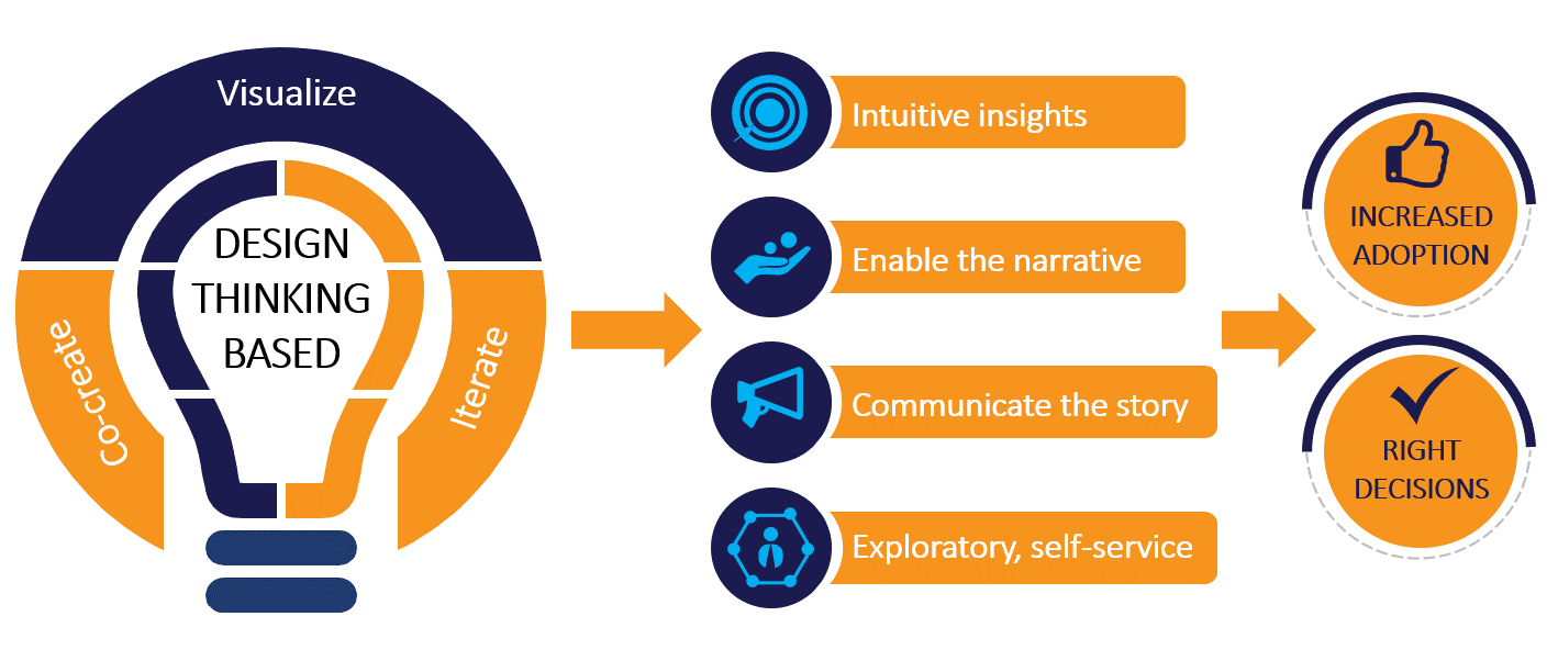
At ITC Infotech, our Digital Design Studio (DDS) takes a data storytelling approach to help organizations visualize data in the most effective manner. The first step in this direction is a Design Thinking approach to co-create and visualize along with the customer teams. In these sessions, we not only create the dashboards but also identify the narrative and create the underlying story. This helps in making a bigger impact with the same set of visualizations
Once upon a time, there lived a princess in a castle, an urchin in the streets, and a genie in a bottle. Do you remember this story? Of course, you do! This is the story of ‘Aladdin and the Magic Lamp’, which we have read in our childhood and still remember. That is what a story does to facts and roles. It makes you understand and remember.
Today, there is data everywhere – from a live sports television channel to a health tracker app on mobile. The world is largely data-driven – charts, graphs, and infographics transcend the language barrier to become one visual language that everybody sees, from farmers to economists. Unnoticed by many of us, data has made its way into our lives, be it treadmills or electricity bills. However, the huge volume of data generated around us is quite useless if it is not analyzed and most importantly, not understood. With the evolution of our cognitive processes, we tend to understand and recollect stories very well. When data is presented as a story then we can connect the dots easily and the whole message becomes clear, almost instantly. So, in the new world of data, storytelling assumes a big role in how we convey the key message to the user.
We are aware that analysis of data brings out the most important takeaways and helps us in making the right decisions based on patterns and correlations. You can even have a series of visualizations, such as dashboards or infographics, that can convey a significant business insight. However, in the absence of storytelling, the last-mile connectivity with users is often lost. This does not undermine the importance of data scientists or software packages. This just goes to say that when we include an element of storytelling, the message is both communicated and understood easily.
I would like to cite a real-life example here. Last year as part of a consumer study we were evaluating the information consumption pattern of farmers from the agricultural belts in the East Godavari District (Andhra Pradesh) and Bellary District (Karnataka). We discovered how easily farmers could understand the weather projections by simply looking at mobile apps. These latest apps were visually representing information about when it might rain or any upcoming dry spell etc. The app even included on-screen lightening and clouds to indicate severe weather. In this case, I realized the farmers were looking at a week’s story and how weather is likely to change and impact them and were not looking at a table of data. It was fascinating to have a first-hand experience of how by including an element of storytelling, an effective representation of data was achieved.
At ITC Infotech, our Digital Design Studio (DDS) takes a data storytelling approach to help organizations visualize data in the most effective manner. The first step in this direction is a Design Thinking approach to co-create and visualize along with the customer teams. In these sessions, we not only create the dashboards, but also identify the narrative and create the underlying story. This helps in making a bigger impact with the same set of visualizations.
 Aesthetics, persuasiveness, and memorability play a big role in a dashboard’s effectiveness. Also, understanding the context is important to design charts that will tell the story and not present data sets. Emphasis also plays an important role. Consider a busy dashboard with eight charts stacked one on top of another. How do you ensure the user gets the right message and action points? How do you ensure the user is following the right path or sequence? There are many emphases forms you can use such as boldface, color, highlights, pointers, labels, and so on.
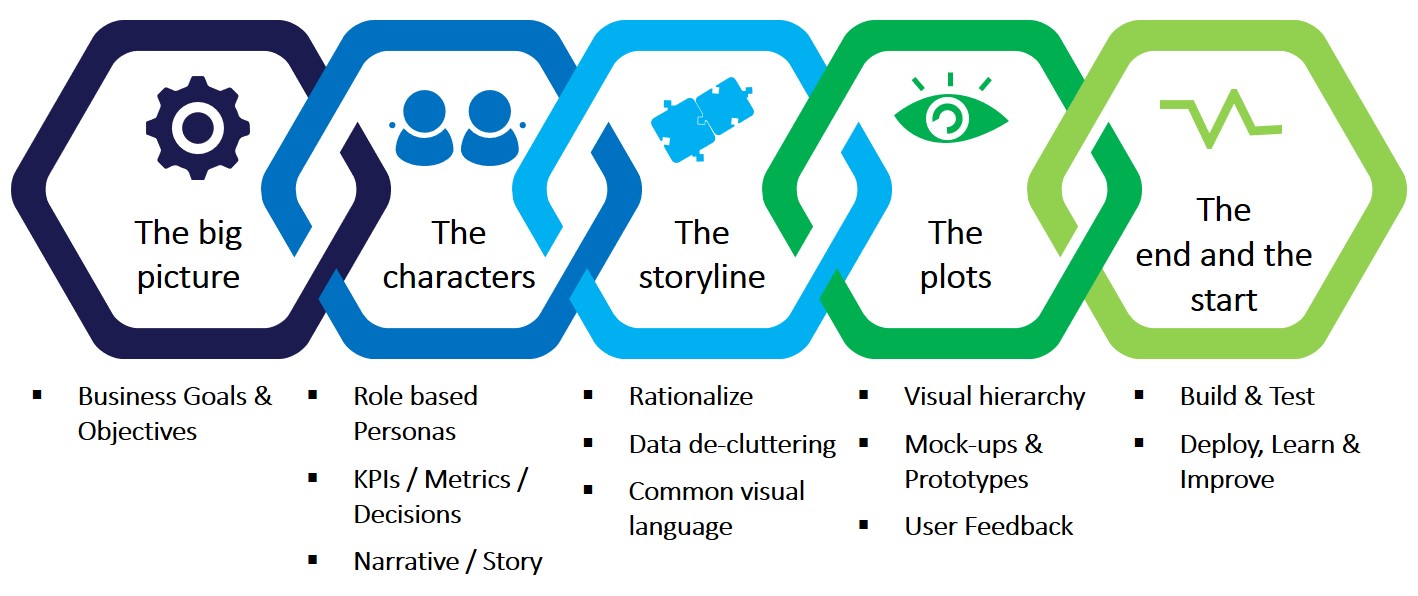
In data visualization projects, we often see the trend to check for a chart library, select a chart type, and click a few buttons and create a chart. Such temptation should be resisted. The approach is that you first understand the concept, review the data, have a design thinking workshop with the stakeholders, and create the base story. All these will help you figure out what is really needed. It will help produce a more memorable experience. Here is a process we follow at DDS in our data visualization projects:
At DDS, we have the capability of working across different visualizations tools. However, tools are a part of the overall experience. The part that is vital is the storytelling. It is not just about the representation of the data in the form of a chart. The next important step is to consider how we transfer the ideas in the chart to the minds of the users. That is where the element of storytelling lies. Stories increase recall, empathy, and persuasiveness leading to overall increase ineffectiveness. For example in a chart depicting a sudden rise in agricultural prices, if you can indicate that there was a famine one particular year, the mind immediately grabs the story behind the price rise and interprets that there was a drought in a year and that led to rise in agricultural prices. The understanding is instantaneous. The storytelling aspect could immediately convey the message to the user. What is key here is to realize that there is a need for a storyline, and you use visualization to deliver the story straightaway; it is not the other way around. Here are some other strategies to convey a story:
- Reveal the story in phases, do not display it all together. This helps build anticipation and keeps the users engaged
- Visualization must focus on delivering the key messages to the users first
- Animation sequence used in a chart is important to convey the message to the users and help them understand the flow of the story better
Recently, DDS has been engaged by one of the largest banks in the Middle East to modernize its dashboard portal. The portal provides the bank’s management and staff with a single point of information. The dashboard includes key performance information related to the portfolio handled by different users and senior management. There are specific user roles and role-based access/information. The key considerations in the modernization project include usability, intuitiveness, ease of navigation, higher adoption, and performance. DDS has created dashboards for multiple groups in the bank using the process explained above and has received appreciation from the bank’s senior management.
One key takeaway is that dashboards and charts will only say what is happening. They will not tell the ‘why’ aspect. This leaves some users struggling to understand the whole meaning. Your narrative will fill in the gaps in the user’s understanding. Overall, all stories have a setting and some conflict that needs a resolution and how the end goal was achieved. If you apply the same narrative principle in data storytelling, the core ideas will be conveyed better and will be understood quicker and remembered.
About the author:
Anirban Banerjee
Senior Project Manager,
Customer Experience


